
Reading price history: how to tell whether that low price really is one
A single price tells you nothing. Only the curve behind it reveals whether you are looking at a genuine low or the end of an artificial rise. Four curve shapes and how to read them.
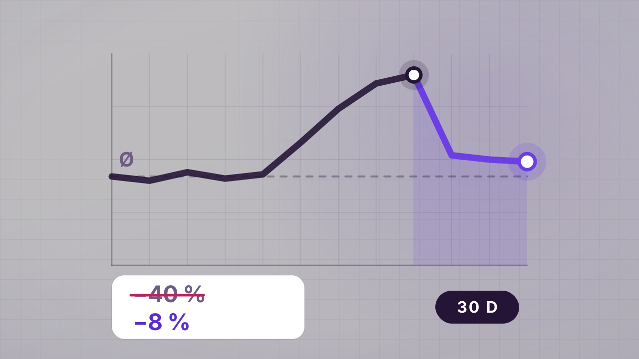
Every product page shows you exactly one number: today's price. That is about as informative as a single still frame from a film. Whether 89 euros is a lot or a little is not decided on the price tag but by what happened in the weeks before — and none of that appears in the offer.
We have written one guide on spotting inflated reference prices and a second on how rare high discounts actually are. This one closes the gap between them: how do you read the curve itself?
The three reference prices — and why only one is any use
Before we get to the curve, you need to know what a discount is actually measured against. There are three candidates, and they are worth very different amounts.
The RRP is a manufacturer's recommendation, not a market price. With electronics the real street price often sits well below it within weeks of launch. A discount against the RRP can be correctly calculated and still completely worthless — with LEGO the effect is so pronounced that we gave it its own guide.
The 30-day low is the lowest price the retailer charged in the past 30 days. Under EU price indication rules it has to serve as the reference whenever a discount is advertised. That is real progress — but a 30-day window is short. Raise the price six weeks before the promotion and you comply with the rule while still suggesting a saving that never existed. On top of that, the obligation does not bite on every form of discount.
The real market price over recent months is the only benchmark that genuinely holds. It is also the only one nobody writes down for you — you have to extract it from the curve.
Four curve shapes and what they mean
Almost every price history in online retail falls into one of these four shapes.
1. The sawtooth. The price oscillates between two levels at short intervals, often weekly. Typical of accessories, small household appliances and anything with heavy competition. Reading: the lower level is the actual price, the upper one is the run-up to the next "offer". Waiting costs you a few days at most — it will come back around, guaranteed.
2. The descending staircase. The price falls in steps and never returns to its old level. This is the normal case for technology with product cycles: televisions, headphones, smartphones, robot vacuums. Reading: every low is a genuine low, but the next one is certain to come. The question is not whether it gets cheaper but whether you want to wait that long.
3. The plateau with a spike. Months of a constant price, then a brief rise, then the "discount" — which lands roughly back on the old plateau. Reading: this is the classic inflated-reference signature. The discount is arithmetically real and economically zero.
4. The one-off drop. A flat run interrupted by a sharp fall over a few days. Reading: this is the case where waiting pays off — clearance, discontinued line, an aggressive competitor. If you see this shape and you need the product, take it. It often does not repeat for months.
How long it makes sense to watch
The observation period should match the product type, not your patience.
- Consumables (detergent, coffee, pet food): two to four weeks. The sawtooth becomes visible quickly, and once you know the rhythm you buy permanently at the lower edge. For exactly this group a subscription discount is often worth it.
- Mid-range electronics: four to eight weeks. Long enough to catch one promotional round.
- Major purchases (televisions, large appliances): three months, or until the next model change. Here the descending staircase is so reliable that waiting is almost always the better decision — provided the old device still works.
- Seasonal goods: until after the season. Barbecues, fans and garden furniture are cheapest in late summer, not in May.
What the curve does not show
Three things stay invisible even with perfect observation, and they are the reason not to over-read price history.
First: running costs. For anything that draws power continuously, the efficiency class decides more about the total price than any discount — we have done the maths for household appliances.
Second: availability. A low price nobody can deliver is not a price.
Third: the cost of waiting. Someone who waits three months for a better washing machine and uses a laundrette in the meantime saves on the price and loses on everything else. Price history is a decision aid, not an end in itself.
Where our numbers currently stand
Instead of an abstract example: here is how discounts are distributed in your marketplace right now. The analysis reads the live offer feed and shows where an individual offer sits within the overall distribution — the yardstick you never get to see on a product page.
23 %
Median discount across all running offers
16 %
of offers reach 40% or more
100
discounted offers analysed
Live sample of 100 current offers from your Amazon marketplace. The distribution shifts by the hour — which is why the ranking matters, not the individual percentage.
Anyone carrying those numbers in their head needs no chart at all for most purchasing decisions. It is enough to know from what percentage an offer in your market actually stands out from the crowd — and from where it merely looks like a discount.
* Prices incl. VAT, plus shipping if applicable. Prices may have changed since the last update; the current price on the merchant’s site applies. Real-time updates are not technically possible.
About the author
Yahya Bolat
Redaktion · hyped4you
You might also like
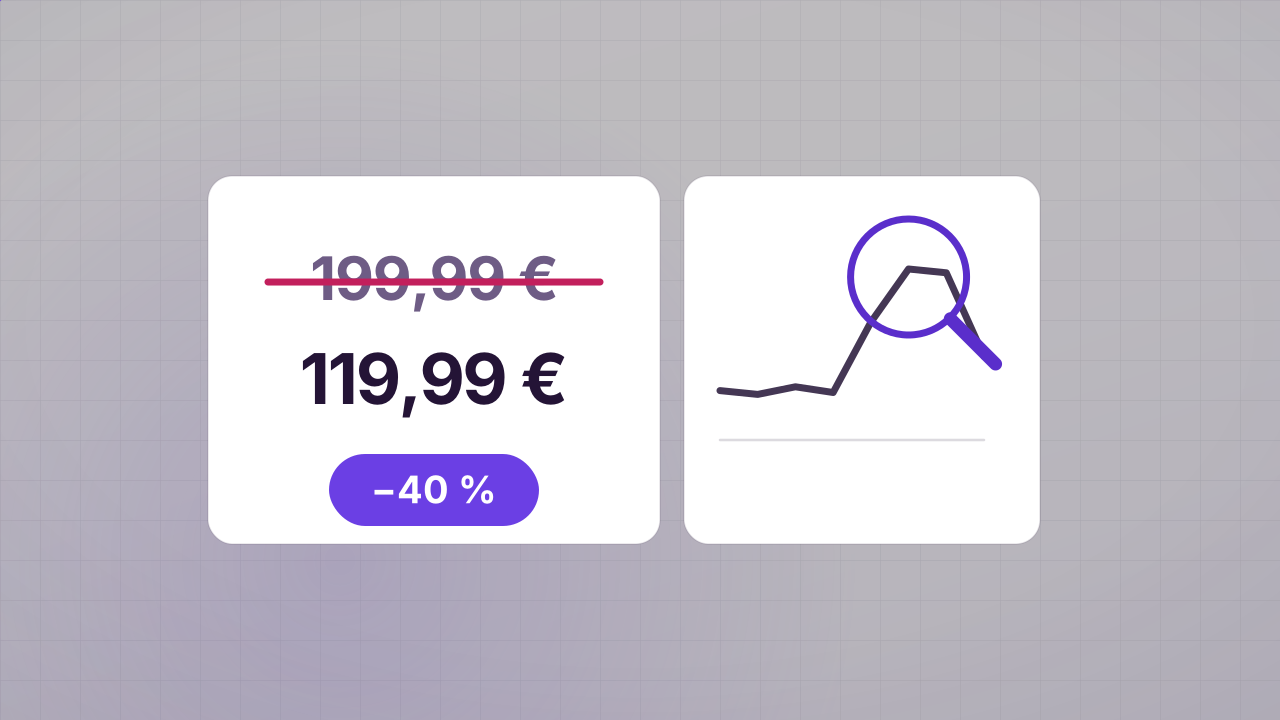
How to spot fake discounts: catch inflated was-prices in 2 minutes
70% off sounds fantastic — until you realise nobody ever paid the crossed-out price. These five checks let you spot inflated reference prices before they cost you money.
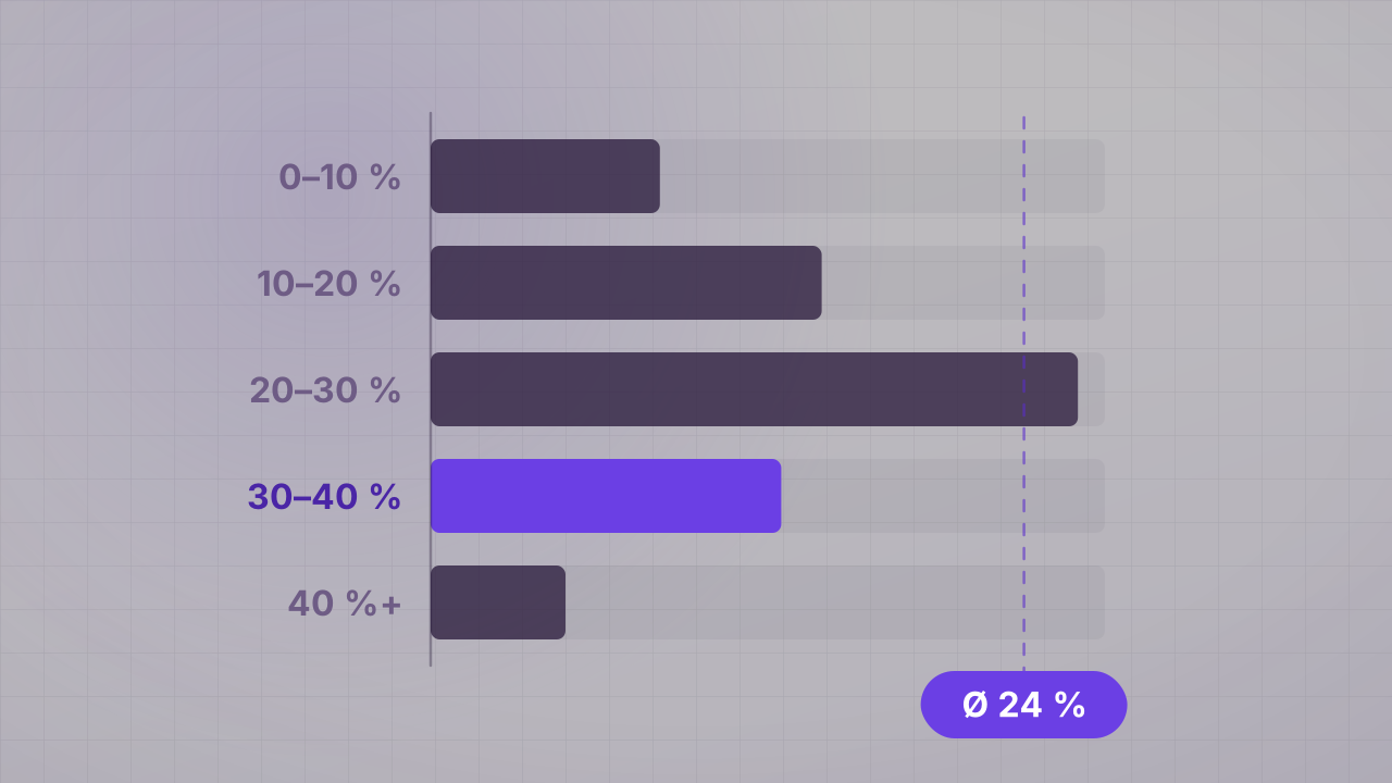
When is a discount actually big? A look at how discounts are distributed
20% off sounds small, 50% off sounds huge. But how rare big discounts really are only becomes clear from the spread across the live offer feed — shown here for your marketplace.